Client
Paul Byrne and Betsy Leatherman


Background
The Breakout Room is a podcast by leadership coaches Betsy Leatherman and Paul Byrne, built around honest conversations about work, self-development and leadership. I was initially asked to give my professional opinion on an existing identity that wasn't landing. That quickly turned into a full rebrand, with just one week to concept, design and hand over the work. The identity also had to work in motion and be modular enough for the hosts' own editor and motion designer to use.


Approach
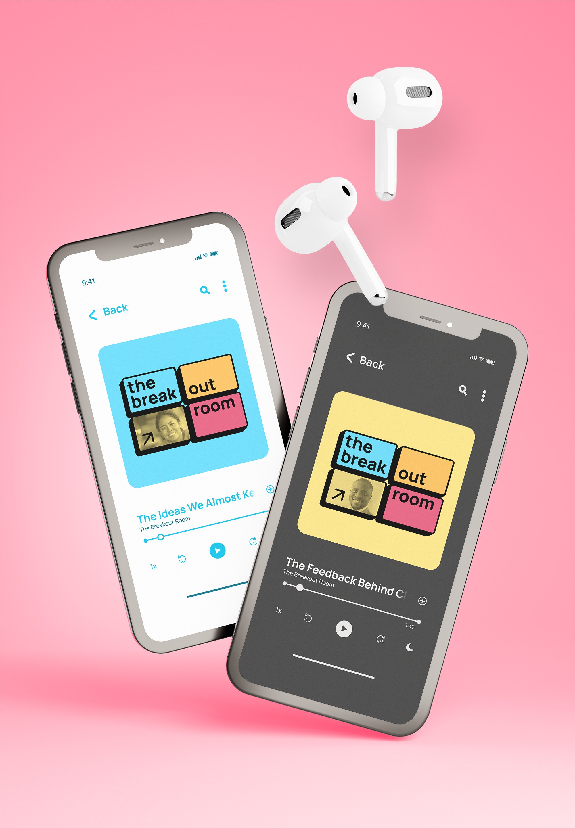
The original identity leaned heavily into travel and airport: yellow signage, generic wayfinding and a visual language closer to a travel podcast than two people talking in a virtual break-out room. After a co-working session to gauge what worked and what didn't, it was discovered that they liked the wayfinding symbolism within those airport spaces. That made sense for a different reason: Paul and Betsy's role is to give people direction, an answer, something to walk away with. After a competitor reseach into the leadership podcast space, I translated these findings into fresh colours, bold lines actually integrating a grid of windows like in a Zoom break-out room within the brand identity. Not just as a backdrop but as the compositional system itself, so the format carries the show's premise without needing copy to explain it. Colour specifically was built as a swappable system rather than a fixed palette, so the identity could survive being handed to another editor or animator without falling apart in someone else's hands.

Outcome
The identity was handed over as a flexible system rather than a collection of static files. I worked with the hosts' editor to make sure the source files held up in someone else's hands, then extended the system across social, thumbnails and promotional materials. The result was an identity that felt distinct from the rest of the leadership podcast space while remaining flexible enough to evolve along with their hosts.

