Client
Frank te Hennepe, ARA Industries


Background
ARA has always been innovative, human-centred and driven by the people who work there, and none of that had changed. The identity had not moved since the 1960s and had quietly stopped saying any of it. In a technical market where trust is won slowly, that reads as a company standing still rather than a company that lasts, and parts of the website had broken outright.
Old Website

New Website
Approach
The brief was a rebrand. The most useful decision was not rebranding. After several explorations and co-working sessions, it was determined that ARA needed a refresh in order to keep its brand equity in this high-trust B2B market. Additionally, ARA's own instinct kept surfacing in the room, if it's not broken, make it better, don't throw it out, and the existing logo simply was not broken. It had good bones, it just needed the small things fixed: kerning, legibility, colour. Apparatenfabriek ARA became ARA Industries. Small changes, and it points the company forward without erasing sixty years of where it came from. Manufacturing defaults to hard edges, beta-led communication and angular type. I went the other way: round forms, softer shapes, a primary serif font and one deep blue carrying the whole system. The website was rebuilt on the same logic, with broken sections cut and navigation shortened. Together with ARA, we decided which user-flows where the most important and which one needed the most fixing. While an external developer executed the vision.


Outcome
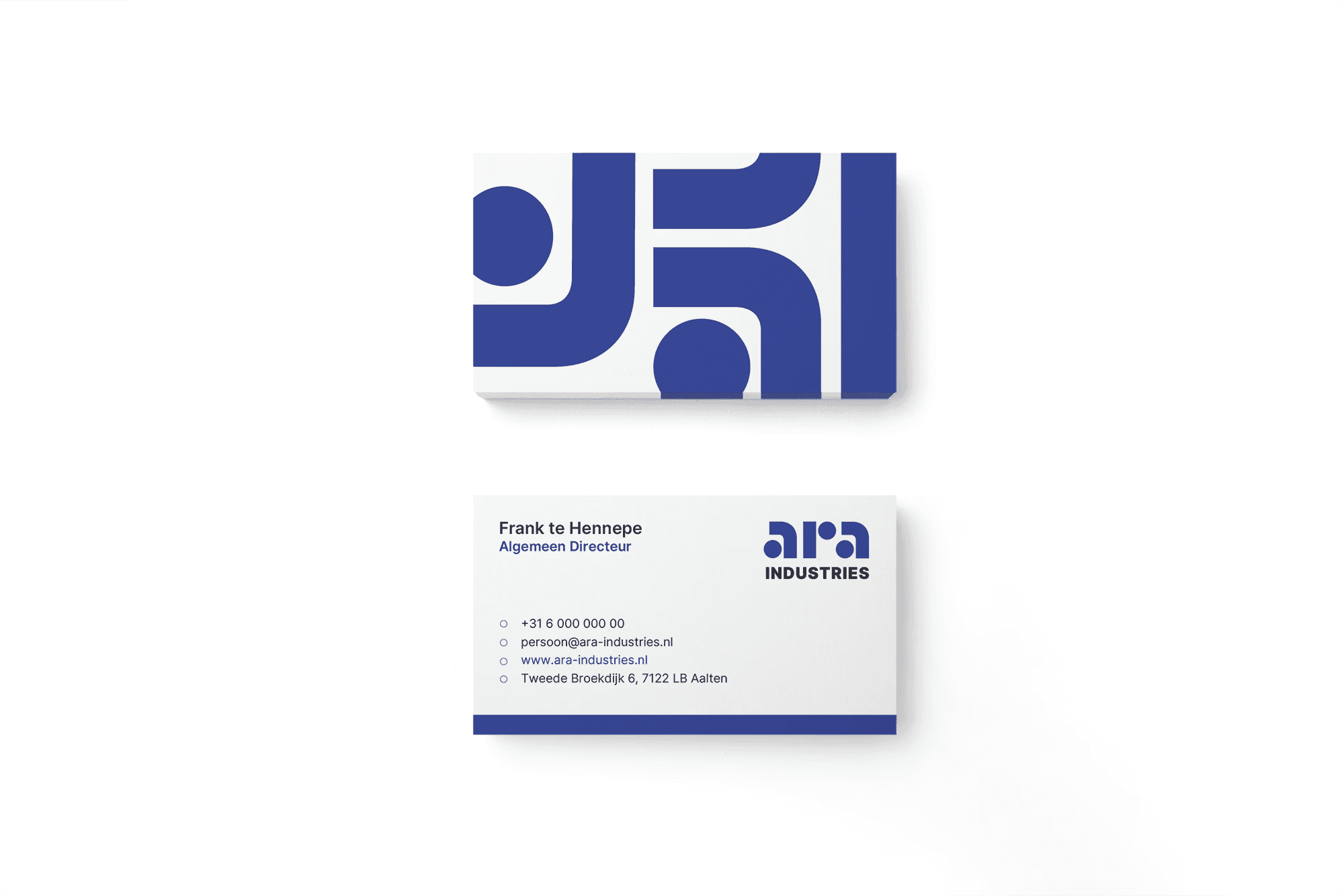
ARA was named Best Knowledge Supplier shortly after the relaunch, in part from being read as a modern company rather than a legacy one, and the client base grew over the year that followed. I developed several print materials, social media templates derived from the brand system after the website went live. The identity, the site and the marketing materials now say the same thing in the same language.

