Client
Timothy Tiryaki and Jeroen Kraaijenbrink
Role
Brand identity, UX design, campaign and social assets. Website built with a trusted developer.
Made at
Independent
Scope
Brand identity
Design system
Website
Campaign
Duration
10 weeks


Background
They came to me with no visual identity and no website, as a newer company in a crowded field where credibility has to be earned before anything else. Leadership consulting mostly looks the same: cold, corporate, heavy. The brand needed to feel trustworthy without going stiff, and structured without losing the human side of what the two of them actually do.
Credits
Development: credited developer to be added. Clients: Timothy Tiryaki and Jeroen Kraaijenbrink.
Approach
The obvious move for a newcomer is to look nothing like the category. The better move here was the opposite. Leadership consulting lives in blues and greys, which reads cold but genuinely signals credibility, and for a company that has none yet that matters more than standing out. So the identity leans on the convention as a foundation and brings accent colour in for warmth, sitting at home in the space without disappearing into it. From there it was a full system: type, colour, spacing and reusable graphic elements, documented so anyone picking the brand up after me keeps it consistent. The signature element is a set of geometric framing shapes that behave like a looking glass zooming in on an idea, and they run across every application from print to digital.
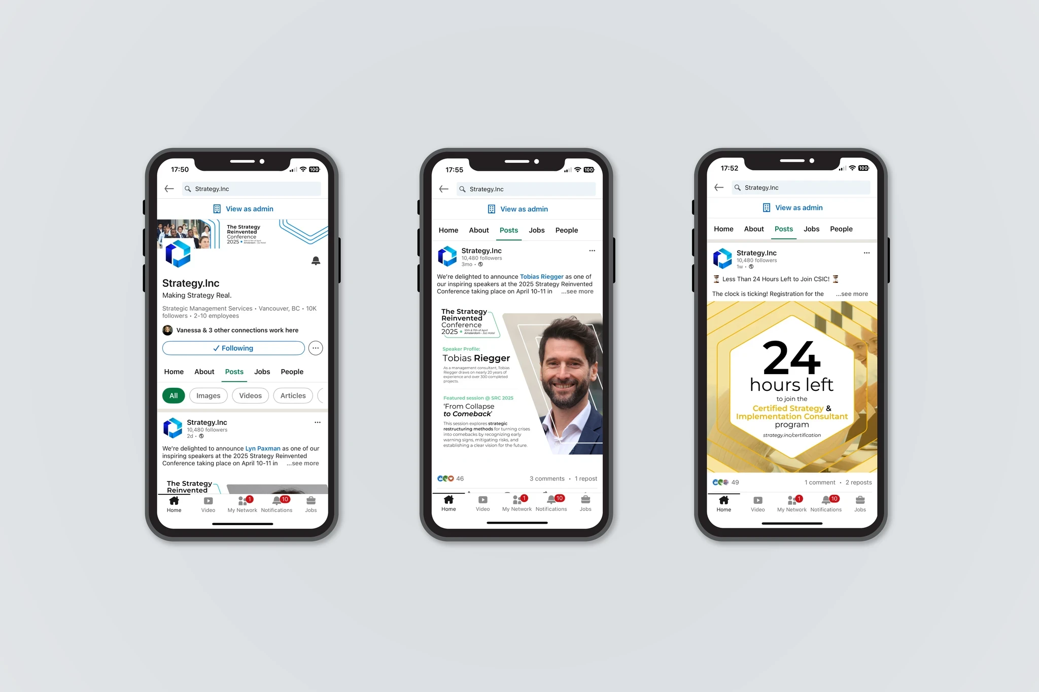
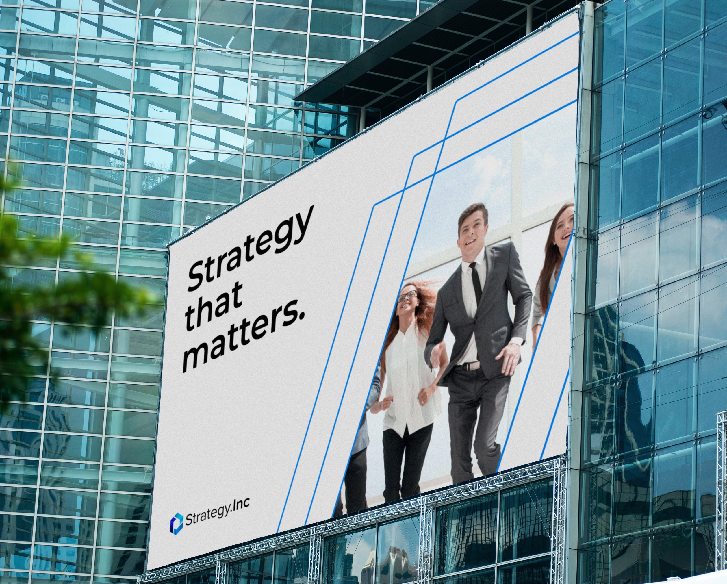

Outcome
The identity carries their everyday communication as well as their campaigns. It then extended into their promotional Strategy Reinvented event across social, web graphics, templates and banners. Some pieces used the core identity directly and others pushed it further, and it held together either way, which is what a system is for.
